My academic garden/field has just thrown up a new bloom in the shape of an article by An Goris which is available, in its entirety, online at Belphégor. An focuses
on three standard elements of the category romance’s paratexts : the front cover iconography, the line template in the design of the category romance’s material packaging and the preview scene that is routinely printed on the first page of a category romance novel.
An's a member of IASPR and helped edit various issues of the Journal of Popular Romance Studies so she knows the field of popular romance studies well. Indeed, I'm sure she's met far more of the people working in this field than I have but, all the same, I'm not entirely convinced she's right about her romance-scholar-colleagues' attitudes towards romance cover art and so I started to feel a bit contrary early on in her article:
the popular romance genre is largely ignored by academics, who deem books that are supposedly all the same unworthy of their critical attention. Somewhat surprisingly, a similar mechanism plays out within the developing field of popular romance studies with regard to the genre’s materiality. Underlying this disregard is, I believe, the tacit assumption that the romance novel’s materiality, which even more than other aspects of the genre is imbued with stereotypes and conventions, is a relatively simplistic and straightforward aspect of the genre that is free of the interpretative complexities romance scholars now regularly (and, notably, against the cultural grain) uncover in the genre’s texts.
Speaking purely for myself, if I've avoided analysing romance covers at length (though I have taken brief looks at them from time to time here and at TMT) it's because I know I don't have the academic training required to analyse visual rather than written works. It should no more be taken as an indication that the cover art is "simplistic and straightforward" than my tendency to ignore rom-coms should be assumed to imply a lack of respect for their actors and directors.
I'd also have to query her statements about the conclusions to be drawn from the visual similarity of category romances which results from their branding by "line". According to An
the public tends to connote the extensive visual and material similarity of the line template in a rather negative way (category romances are generally considered inferior forms of literature because they are – or at least materially appear to be – so similar)
However, wasn't the iconic Penguin paperback design doing something very similar?
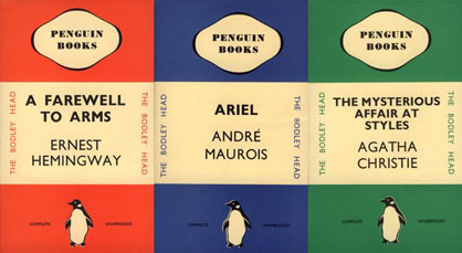
In the early days [of Penguin], [Allen] Lane insisted that all books followed a rigorous application of colour, grid and typography. Each genre was allocated its own colour: orange for fiction, green for crime and blue for biography. This commitment to design was further strengthened under the direction of German typographer Jan Tschichold in the 1940s.
He designed a template to be used for all Penguin books with designated positions for the title and author’s name with a line between the two. He also unified the design of the front, the back and the spine and redrew the Penguin symbol in eight different variations. This strict design ethos ensured that the same style was always applied.
So perhaps it's not the branding which causes members of the public to make assumptions about Mills & Boons/Harlequins, but their pre-existing beliefs about HM&B books which cause them to interpret HM&B's "strict design ethos" in a very different way from Penguin's or, indeed Virago's?
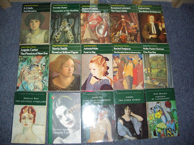
(photo from Paperback Reader's blog).
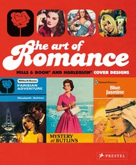 I also noticed that although An is focussed on the cover art of category romances, she doesn't mention Joanna Bowring and Margaret O'Brien's The Art of Romance: Mills & Boon and Harlequin Cover Designs (2008). Admittedly Bowring and O'Brien's book doesn't provide rigorous academic analysis:
Part of a centenary celebration, this collection of some two hundred Mills & Boon covers offers a fascinating visual record of how our perceptions of romance, love, and drama have evolved over the years. With titles such as Romance Goes Tenting, Egyptian Honeymoon, and Beware the Beast, these novels' contents have changed dramatically as women defined their roles in the 1920s and 1930s; searched for heroes during World War II; strove for careers in the 1950s; engaged in free love in the 1960s; yearned for sexual emancipation in the 1970s and 1980s; and ultimately learned a lot about self-reliance while waiting for Prince Charming to show up.
These social transformations are reflected in the covers, chronologically arranged as full-color plates. An introduction charts the changing themes of the novels and explores the reasons behind the enduring popularity of the romance novel.
However, I did enjoy looking at all the covers and with over 200 "full-color plates" it would presumably make a good resource for someone interested in the genre's "materiality".
-----
Goris, An, 2015. "Hidden Codes of Love : The Materiality of the Category Romance Novel." Belphégor.
Sheppard, Stacey, 2011. "Judging a Book by its Cover." We Make Magazines.